Overview
This is the follow-up to part one, where I trained One-Punch Man and Demon Slayer style adapters and then bolted a lettering and page-composition pipeline onto whatever the model produced. The art was fine. The pages were not.
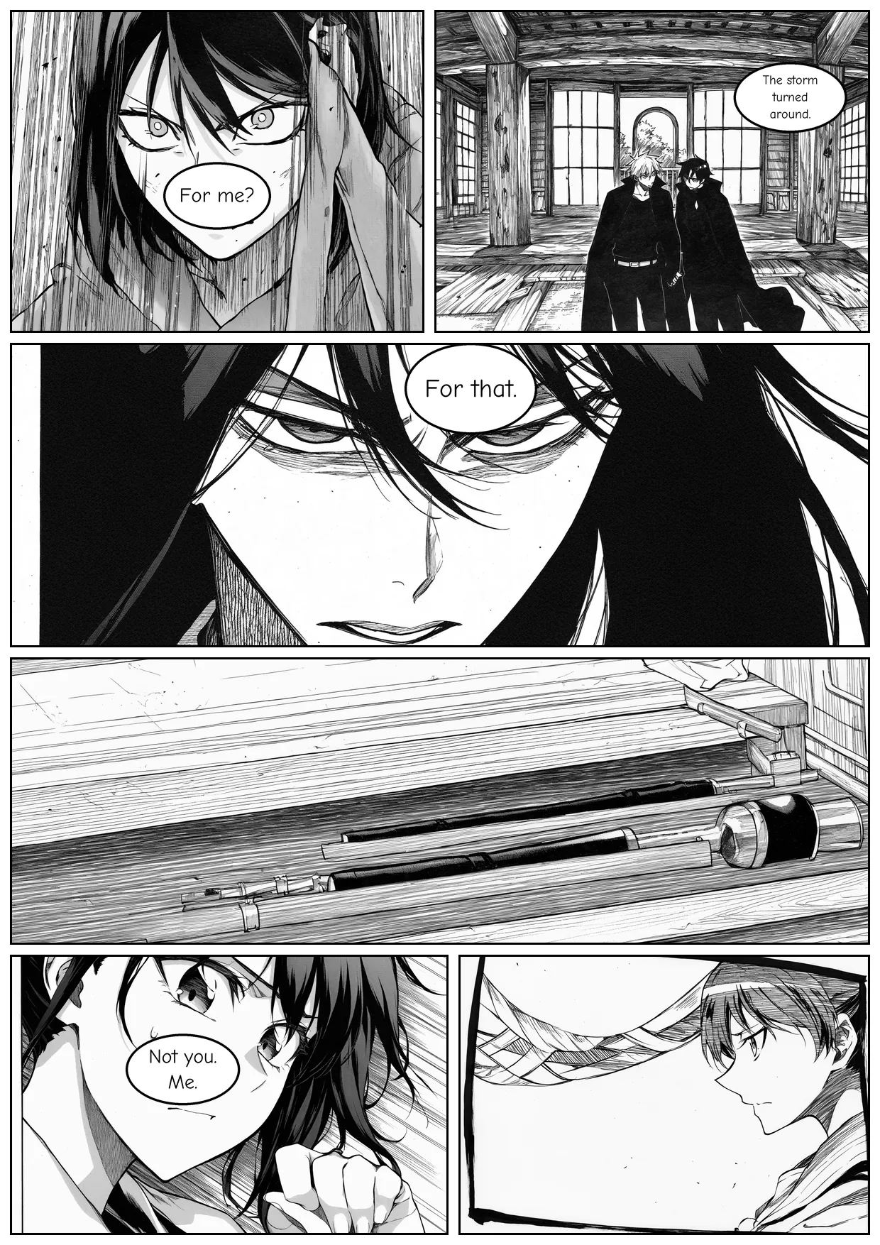
A real manga page has four to eight panels, irregular splits, tiers that carry a conversation, and a reading order you follow without thinking. What I had was nine hand-drawn rectangular templates, a four-panel ceiling, and every panel cropped to fit its slot.
That last part was the real problem. Cropping means a panel is generated at whatever size the model likes, then trimmed to fit the hole it has to sit in. Across my template library that threw away a median of 48% of every render, and because cropping is centre-biased, the first thing to go was usually a character's head.
Everything else here serves that rule. A three-style adapter supplies the ink, a layout library mined from real manga supplies the paneling, and a prose-to-tags front end lets a paragraph of story drive both. Part one was about letting each component do the job it is good at. This part is about the order those components run in.
Results at a Glance
- Three manga styles in one LoRA. Bleach monochrome, Bleach Official Colored, and JoJo Part 5, trained as three concepts in a single file on NoobAI-XL v-pred 1.0. It is 456 MB at rank 64, and I selected step 3,600 of 4,200.
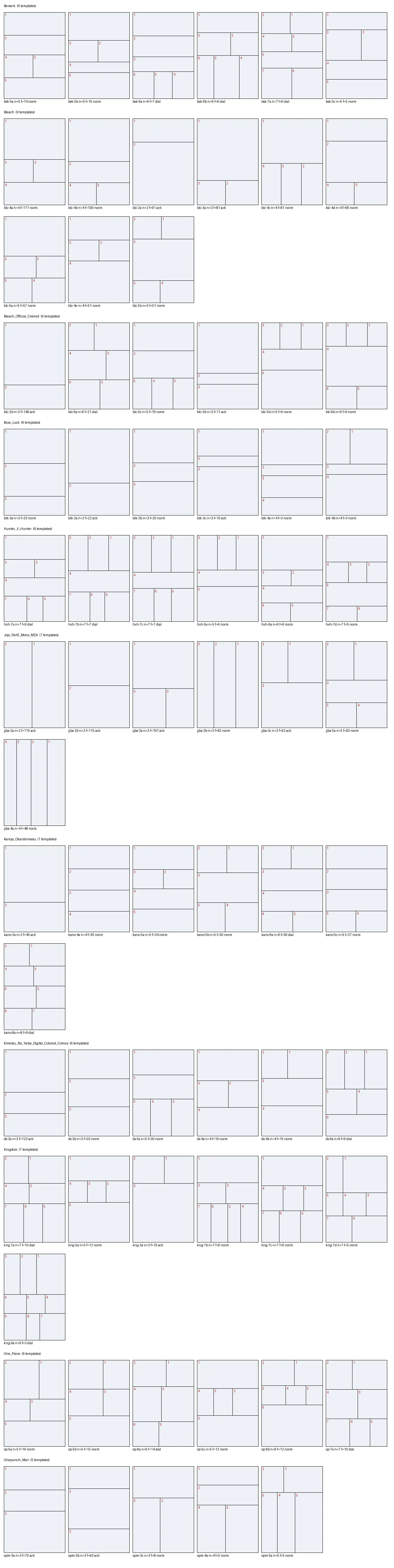
- A mined layout library. 71 page templates recovered from 11 series and 5,109 pages. Each one is tagged with the series it came from and how often that shape actually appears.
- Panels drawn for their slot. Every panel is now generated at the aspect ratio of the hole it will fill. Across the mined library that takes the median crop from 48.2% to 1.55%, and on the demo run every one of 66 renders came out at exactly the size the planner asked for.
- One script, three inks. The same five-page story renders in all three styles. The test suite went from 60 to 214 passing tests, and the phase cost $2.82 across roughly 3.7 hours on one rented RTX 4090.
The New Base Model Rendered Cyan Noise
Part one ran on Illustrious-XL v0.1, which its own authors describe as an untuned research checkpoint. The obvious upgrade was NoobAI-XL v-pred 1.0: same SDXL architecture, so nothing in my pipeline had to change, but a different training objective and a different noise schedule.
Those two differences are the reason I bothered. Most diffusion models are trained to predict the noise added to an image, then subtract it. A v-prediction model predicts a blend of the image and the noise instead, which behaves more consistently across the whole range of noise levels. Zero-Terminal-SNR is the schedule half of the pair: it makes training start from pure noise rather than from slightly noisy images, so the model learns the full tonal range instead of settling into a muddy grey. For a heavy-ink monochrome style, true blacks are not a nice-to-have.
I pulled both the v-pred checkpoint and the eps 1.1 fallback onto the pod up front. They are 6.6 GiB each and arrived in about half a minute apiece, so tested insurance on disk cost nothing. Then I rendered one image before spending any money on training. This is what came out.
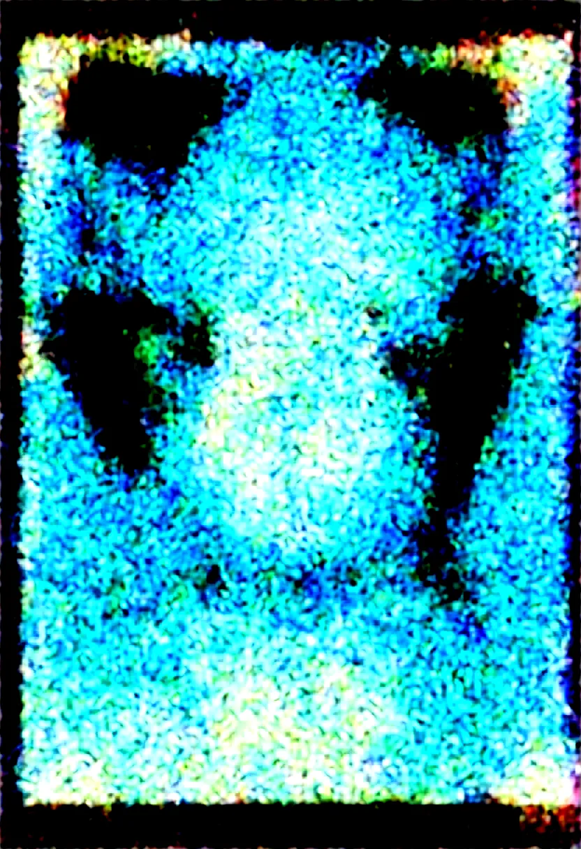
This is not random garbage. Every denoising step subtracted the wrong quantity. The model was reporting a blend of image and noise, the scheduler treated that report as pure noise, and so each step pushed the latent somewhere that never converged toward a picture. The cyan speckle is what the decoder produces from a latent that never became an image. The weights were healthy the whole time. Only the assumption about what they predict was wrong.
My automated check said this render was fine. I had gated it on pixel standard deviation, expecting a broken model to produce flat grey, so I looked for std < 12. Sampled as epsilon it produces high-variance coloured noise instead, at std 110, which sailed through. I then proposed a better screen, mean absolute Laplacian, on the theory that noise is high-frequency and drawings are not. That failed in the opposite direction hours later, when a good Bleach action panel scored 96.5 against a noise threshold of 25, because dense hatching is high-frequency energy. There is no scalar screen for this domain. Both numbers stayed in the logs as description and never again as a verdict.
The cause is a quiet behaviour in diffusers. The checkpoint header carries v_pred and ztsnr keys that say exactly what the file is, and from_single_file() does not read them. It loads with prediction_type = "epsilon" and reports no problem. The fix is to state it yourself, as keyword arguments:
pipe.scheduler = EulerDiscreteScheduler.from_config(
    pipe.scheduler.config,
    prediction_type="v_prediction",
    rescale_betas_zero_snr=True,
    timestep_spacing="trailing",
)
The keyword arguments matter more than they look. The version I wrote first, and the version you will find in most places, copies the config into a dict, mutates it, and passes the dict. On diffusers 0.32.1 that half-applies: any key you never set explicitly is listed in the config's _use_default_values and from_config quietly reverts it, so prediction_type survives and rescale_betas_zero_snr does not. My own eval log says ztsnr=False on every line, so the checkpoint ladder was judged without the schedule half of the fix. The images were fine either way, which tells me the cyan noise was the prediction type alone.
I keep this story near the front because it is the cheap version of an expensive mistake. Skipping that one test render would have cost an hour of GPU time, and much longer wondering whether my dataset, my captions, or my learning rate had broken the run.
I Mined Page Layouts Instead of Drawing Them Myself
My extraction script already runs Magi over every page to find panel bounding boxes, crops those boxes out for training, and then throws the boxes away. But those boxes are the page layout, drawn by a professional. All through part one, I had been deleting the most useful artifact in the pipeline on every run.
So the extractor now writes one JSONL record per page alongside the crops: every panel rectangle, normalized to 0-1 coordinates, tagged with its series and whether the page was a spread. Spreads get split at the fold before anything else, right-hand page first, or every two-page spread would cluster into a fake ultra-wide template.
A separate miner turns those records into templates. It reads each page as a structural signature, meaning how many rows, how many panels per row, and roughly how tall each row is. It groups pages sharing a signature, averages each group into a centroid, and rebuilds that centroid as a tiling of rows. The library went from 9 hand-authored templates to 71 mined ones over 333 slots, covering 2 to 9 panels per page.
I Trained Three Styles Into One File
I trained Bleach monochrome, Bleach Official Colored, and JoJo Part 5 as three concepts inside a single LoRA, one trigger token each. Kohya's sd-scripts supports this natively. One subfolder per concept, and the trigger held at caption token 1 with --keep_tokens 1 --shuffle_caption.
The three are useful together rather than just cheap together: a dramatic monochrome look, a real-colour one, and a cinematic one. Colour matters because Bleach has a complete official coloured edition, so I could train colour on real coloured pages instead of reconstructing it. The pairing also keeps the experiment honest, since two of the three concepts are the same artist differing mainly in palette. That is the most bleed-prone combination available to me.
The Dataset Had to Be Balanced Exactly
In Kohya, how much a concept influences the adapter is repeats multiplied by image count. An unbalanced product looks, in the output, exactly like style bleeding. So all three concepts landed on exactly 600 images at 10 repeats, products identical at 6,000. That removes the failure mode by construction rather than by inspection.
Resolution decided how hard that was, not how much source material existed. The high-resolution MangaDex pages had four to five times more eligible panels than I needed. The roughly 800 pixel Bleach scans gave me 634 eligible panels against a 600 target, because 68% of their panels fell under the 512 pixel floor. Five percent of slack, on the concept I cared most about.
Captioning got a hard gate rather than a spot check. All 1,800 captions were tagged with WD14 SwinV2 v3 as in part one, then verified to carry the trigger at token 1 before training was allowed to start. A misplaced trigger produces output indistinguishable from style bleeding, and I did not want to diagnose that later from images.
Two details from that pass I enjoyed. The tag comic appeared in half the raw Bleach captions and gets stripped before training, because on Danbooru comic means multi-panel grid, which is the one thing this model must never draw. But blank speech bubble is deliberately kept, because the lettering stage works by finding empty bubbles the model drew on its own.
Monitoring Style Bleed
The training sample grid was built as an instrument rather than a preview. Two prompts, repeated once per trigger with identical wording and the same seed, saved at every checkpoint. If the three styles were going to collapse into each other, I wanted to see it at step 900 and kill the run.
The first useful reading came at step 900, and the two monochrome triggers were pulling apart. Bleach was trending dark and JoJo Part 5 was trending light, from the same prompt and seed. The colour trigger held three to nine times the chroma of either monochrome one.
| Same face prompt, seed 42 | Step 300 | Step 600 | Step 900 |
|---|---|---|---|
| Bleach mono, mean luminance | 100.5 | 57.7 | 58.2 |
| JoJo Part 5, mean luminance | 122.0 | 150.9 | 144.1 |
| Separation between them | 22 | 93 | 86 |
| Bleach colour chroma (mono sits at 0.5-1.0) | 3.77 | 4.05 | 3.30 |
Mean luminance runs 0 to 255, so lower is darker ink; chroma sits near 1 for monochrome and climbs with colour.
I also checked manually by eye, because a luminance number can move for boring reasons. At step 900 Bleach was solid black shapes with dense parallel ink lines, and JoJo Part 5 was grainy printed dots with clean thin outlines. Two different drawing techniques out of one file. That last part surprised me: I had assumed the model would blur the printed dots into flat grey, but the big dots stay clearly visible. The difference is how tightly the dots are packed, and really fine dots still have to be added afterwards.
I Picked the Checkpoint by Looking, Again
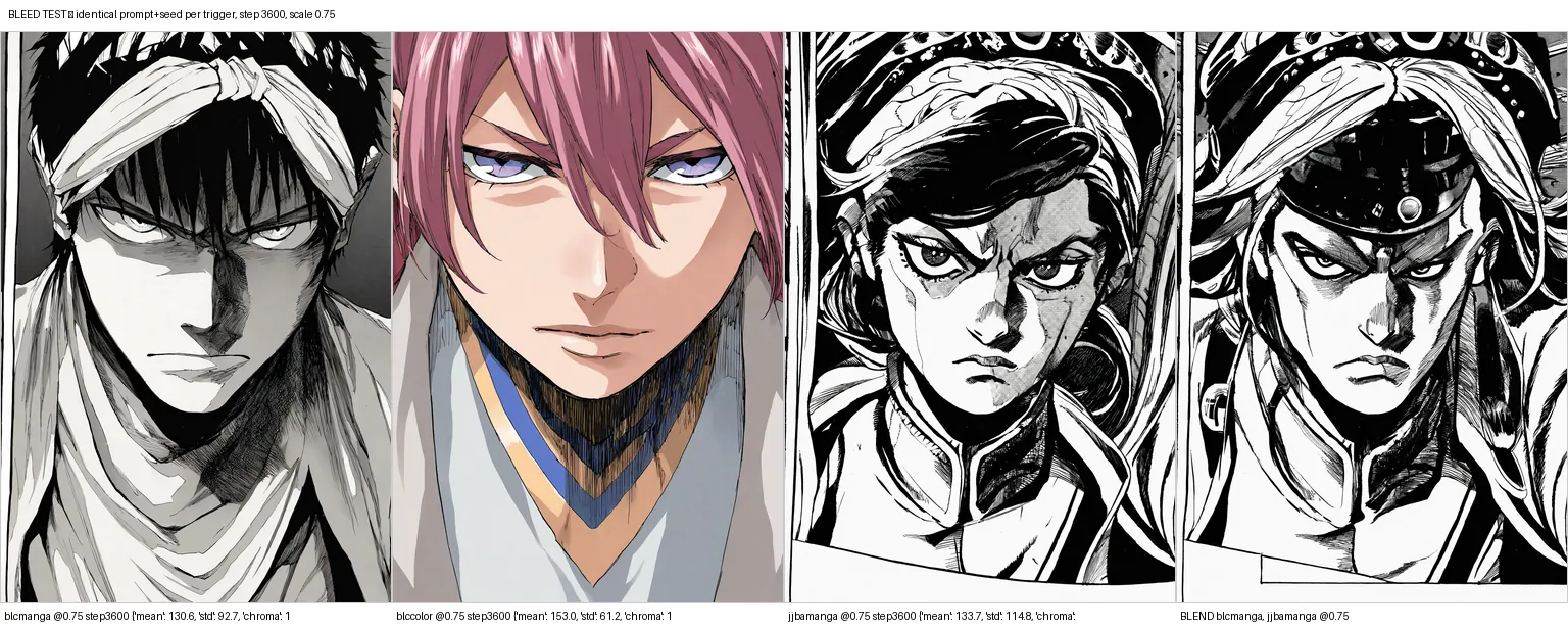
The evaluation specific to multi-concept training is the bleed test. One prompt, one seed, rendered once per trigger and tiled side by side. All three triggers separated at every checkpoint I tested, and the separation got stronger with training rather than weaker. At step 3,600, coloured Bleach measured 14.94 chroma against 1.7 and 0.4 for the two monochrome triggers.
Chroma is how colourful a pixel is: near zero is grey, higher means stronger colour.
So at step 3,600 a chroma of 14.94 means the colour trigger was painting in full colour, while the 1.7 and 0.4 are effectively grey.
The same-artist Bleach pair, the one I had been worried about, was the cleanest separation of the three.
I re-ran the test at the checkpoint I finally selected, because bleeding grows with training time and a result from step 900 does not justify a choice at step 3,600. It held.
For choosing the checkpoint I rendered a grid: four checkpoints (2,400 / 3,000 / 3,600 / 4,200) against three LoRA scales (0.6 / 0.75 / 0.9). Each cell holds two images, a style-fidelity face prompt and a deliberately off-style chibi prompt. The second one tests whether the adapter has overfitted into ignoring what I asked for, which is fatal in a pipeline where a script decides what every panel contains. So the judging order was prompt adherence first, then style fidelity, then anatomy.
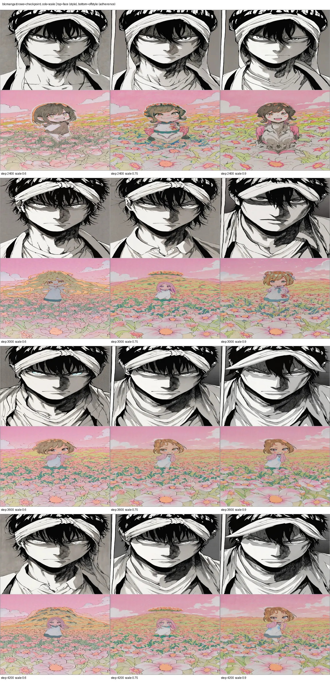
The winner was step 3,600 at scale 0.75. Both part-one runs had also landed at roughly 75% of training, and 3,600 of 4,200 sits in the same window. Three runs into this project, the last checkpoint has never been the best one. The whole evaluation was 124 renders in about 11 minutes, against 45 budgeted. One caveat: the scale sweep only ran on Bleach, a cost trim I wrote into the plan on purpose, so 0.75 is measured for Bleach and inherited by the other two triggers.
The Adapter Learned to Draw Panel Borders
The eval grid surfaced a problem I had not thought to look for. The JoJo Part 5 trigger draws a black panel border around its output, and sometimes spiral-binding furniture at the frame edge. Of course it does. The training crops came from real pages and include the drawn panel frame, along with whatever sat at the edge of the scan.
That matters because my compositor draws its own borders, so a panel arriving with one of its own gives every page a double border. The fix was free and on the generation side: page-furniture terms in the negative prompt (border, frame, sketchbook, spiral notebook, paper, page number, panel border), baked into every preset. Re-extracting the dataset with an inset crop and retraining would have cost about $2.15 and 90 minutes to fix what one negative line fixes.
Panels Are Now Drawn for Their Slot
The core defect of part one was an ordering problem, not a modelling one. Panels were generated at a fixed size and then cropped to fit whichever slot they landed in. A portrait render dropped into a wide establishing slot lost most of its content, and because the crop is centre-biased, heads went first. No amount of better training fixes that. The fix is to invert the order:
- Writestory becomes a script, with beats written before any template is chosen
- Planpage template chosen from the mined library, frequency-weighted, each slot's aspect computed
- Generateeach panel rendered at the SDXL size nearest to its own slot's aspect
- Letterbubbles and text rendered at the slot's exact pixel size
- Composepanels pasted at roughly 0% crop, gutters and borders drawn on top
Step three is where the work is. SDXL cannot render an arbitrary size. It works from a ladder of legal resolutions, all roughly one megapixel and divisible by 64, and Kohya trains against 41 of them. The bucket chooser maps a slot's aspect ratio to the nearest rung on that ladder.
How many rungs you use turns out to matter a lot. My first design used only the six commonly quoted SDXL sizes. Measured across all 333 slots in the mined library, six buckets give a median crop of 9.93%, which fails the 3% target I had set. The full ladder gives 1.55%. For reference, part one's fixed-bucket behaviour cropped a median of 48.2% of every panel.
| Slot-aspect policy | Median crop across 333 slots |
|---|---|
| One fixed 832x1216 bucket, part one behaviour | 48.2% |
| Six commonly quoted SDXL sizes | 9.93% |
| Full 41-bucket ladder, all slots | 1.55% |
| Full ladder, only the 246 slots it can serve | 1.12%, worst 3.68% |
| The 87 thin strips outside the ladder | up to 68%, cropped by design |
Two details in the chooser are worth stealing. It minimizes log distance between aspect ratios rather than absolute distance, because aspect is a ratio. Going from 0.5 to 0.6 and from 1.67 to 2.0 are the same mistake and should cost the same. Absolute distance quietly biases every choice toward the wide end. And it corrects for page aspect, which is where the whole crop budget lives. The page is portrait B5 at aspect 0.707, so a slot that is full width and half height is aspect 1.41 in real pixels, not 2.0. Chase 2.0 and the chooser reaches for a bucket far wider than the slot, producing exactly the letterboxing the feature exists to remove.
The median also hides a heavy tail. Mined slot aspects run from 0.146 to 5.98, because real manga is full of thin strips, and SDXL starts duplicating heads once the short side drops below roughly 700 pixels. So 87 of the 333 slots sit outside what the ladder can serve and get cropped on purpose, sometimes heavily. A shot-aware bias softens those, so a close-up crops toward the upper third where the face is. The accurate description of a hard-cropped panel is that it discards 46% of the render, chosen to keep the face. The number that makes the tail a documented limit rather than a defect is not the median. It is the in-ladder maximum of 3.68%, pinned by two tests that fail if it ever regresses.
There was also a small farce here. An independent check of my crop numbers came back with four different figures, and all four were explained by one missing definition. A full-width, half-height slot is 2.0 in normalized units but 1.41 in real pixels, because the page is portrait B5. Nobody was wrong. Nobody had written the definition down.
I Wired the Lettering to the Layout
The lettering machinery from part one worked, but it sat on top of the layout rather than knowing anything about it. Three changes connected the two.
Right to left everywhere. The pipeline now defaults to right-to-left in every place that has to agree: mined slot ordering, compositor fill order, bubble fill order, and script output.
That was the most stubborn bug of the phase. Reading order broke twice, in different places, and both breaks were invisible to every check except one specifically looking for reading order. First my tiling code returned slots in sorted order, discarding the right-to-left order established upstream, and my own test caught it. Then a second pass found the two template families stored their rows in opposite conventions: the nine hand-authored ones left to right, the 71 mined ones right to left. The compositor's blanket rule of reversing for RTL therefore produced left-to-right pages for every mined template, and the test I had written asserting RTL storage had locked that violation in place. The final fix derives reading order from the slot geometry, so neither storage convention can be wrong.
Letter at the slot's pixel size, not the render's. The font size floors in the renderer are absolute pixel numbers. Lettering a panel at its render resolution and then scaling it into a small slot made the text unreadable. Lettering at the slot's final size makes font size a function of page size, which is how real lettering works.
Tails point at speakers. The speaker_box field that part one defined and nothing ever wrote is now filled from the script's character positions. No model is involved. Dialogue stays as structured JSON until the final render pass, so wording can be edited, validated, or translated without touching the art.
The script writer picks a page template by id from the mined library. It sees a table of ids with panel counts, intensities, frequencies, and a one-line shape description, and it never sees coordinates. Language models pick reliably from a list of ids and invent geometry badly. Beat count drives panel count, dialogue is capped at manga-realistic terseness, and the strict-JSON-with-one-retry contract from part one survived unchanged.
What Else Changed in the Generator
Four changes mattered.
- The old negative prompt was working against the pipeline. It negated
monochromeandgreyscale, copied from configs written for people who want colour, and carried several tokens with zero Danbooru posts behind them. The replacement suppressescomic(715k posts, meaning multi-panel grid), speech bubbles, and pseudo-text, because the pipeline supplies all three itself. - Prompts are tags now, translated from prose. These are Danbooru-tag-conditioned models, so a paragraph-shaped prompt spends the 77-token budget on words carrying almost no learned direction. A translator converts prose into tags constrained to an allow-list built from my own captions, 1,009 distinct tags over 1,800 captions, which is by construction the exact vocabulary the adapter trained on.
- Long prompts stopped truncating silently. I installed compel to get past the 77-token wall and it crashed on every render, because its own padding function is unimplemented for SDXL's two-encoder path. Falling back to the plain encoder would have truncated a 141-token prompt and deleted the subject of every image, so I pad manually with the empty-prompt embedding.
- Perturbed Attention Guidance is on, and I am not claiming it won anything. My notes had PAG at 2.0 as the likely structural improvement, with a warning that too much reads as muddy grey in monochrome. A/B tested at the same seed there was no grey haze and no visible gain either, so it stays on as a no-harm default with the claim undemonstrated.
The mono/colour switch is three mechanisms stacked. For Bleach it is solved at the training level, since --palette mono and --palette color just select the two Bleach triggers. For a style with only monochrome training data there is a prompt-level fallback, turning the adapter down and moving palette tags to the negative. And monochrome is guaranteed rather than requested, because a grayscale pass in post is why the mono pages measure exactly 0.00 chroma. Which is a good moment for the one trap I would pass on: never put monochrome, greyscale in a negative prompt when you want monochrome output. Most copy-pasted negatives include them, and they will fight your whole pipeline while looking perfectly reasonable.
Fifteen Pages From One Script
The acceptance test for the phase was one original five-page story, rendered from the identical script in all three styles. 66 panels, and 0 size mismatches against the sizes the planner asked for. Nine distinct SDXL buckets were exercised across the 22 panels of a single story, from 704x1536 up to 1536x704. Panels changing size within one page is what layout-first generation looks like from the outside.
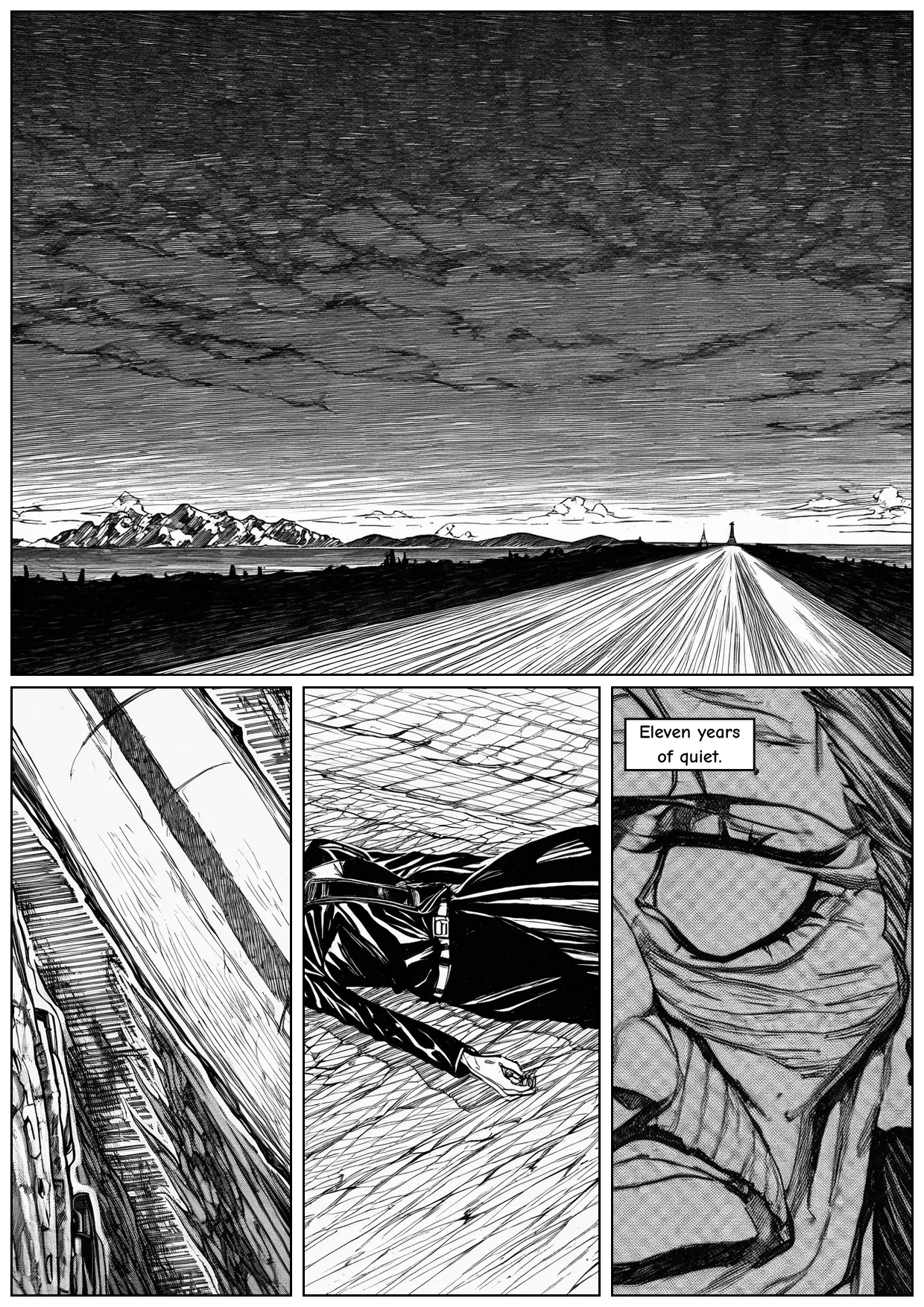
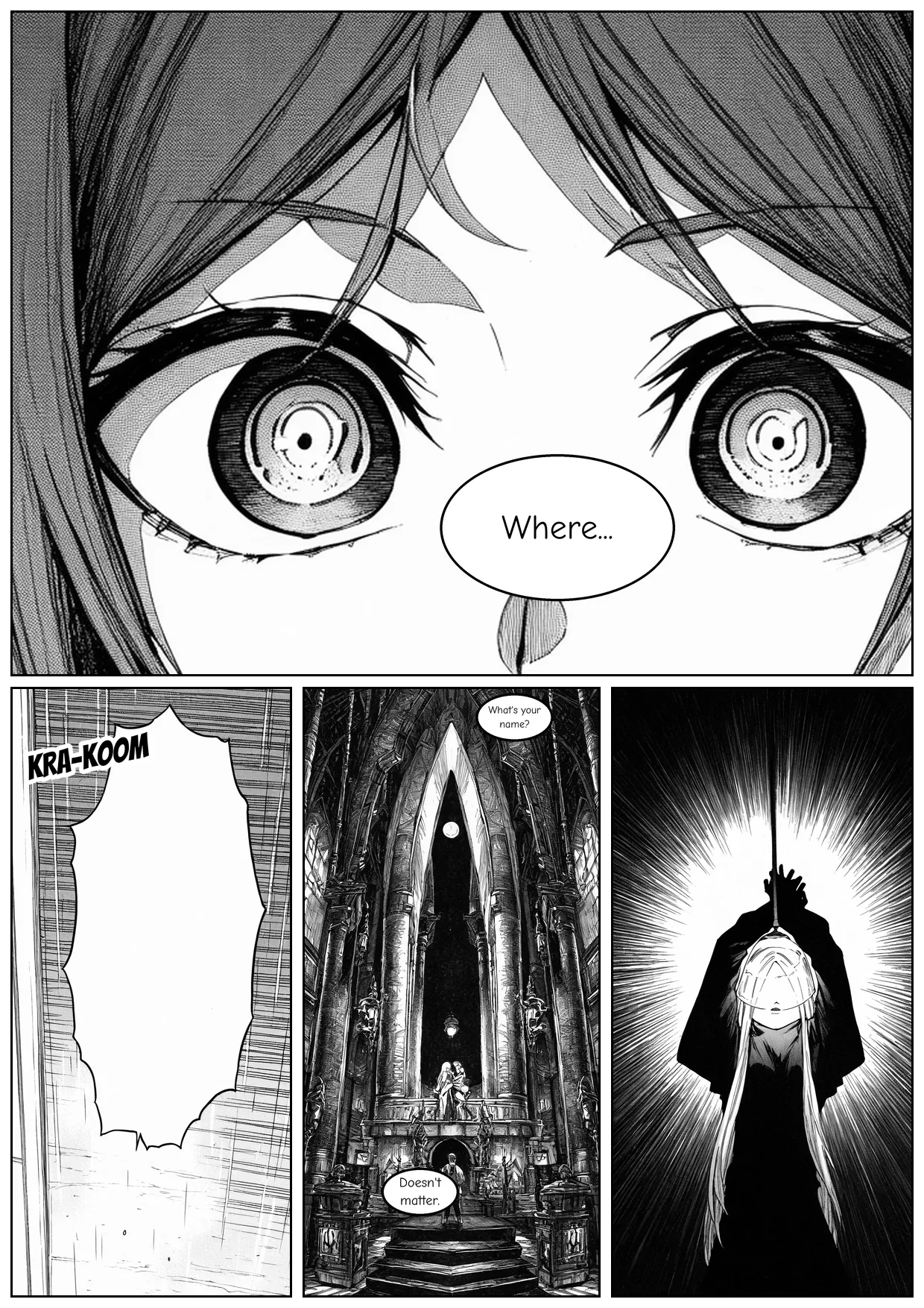
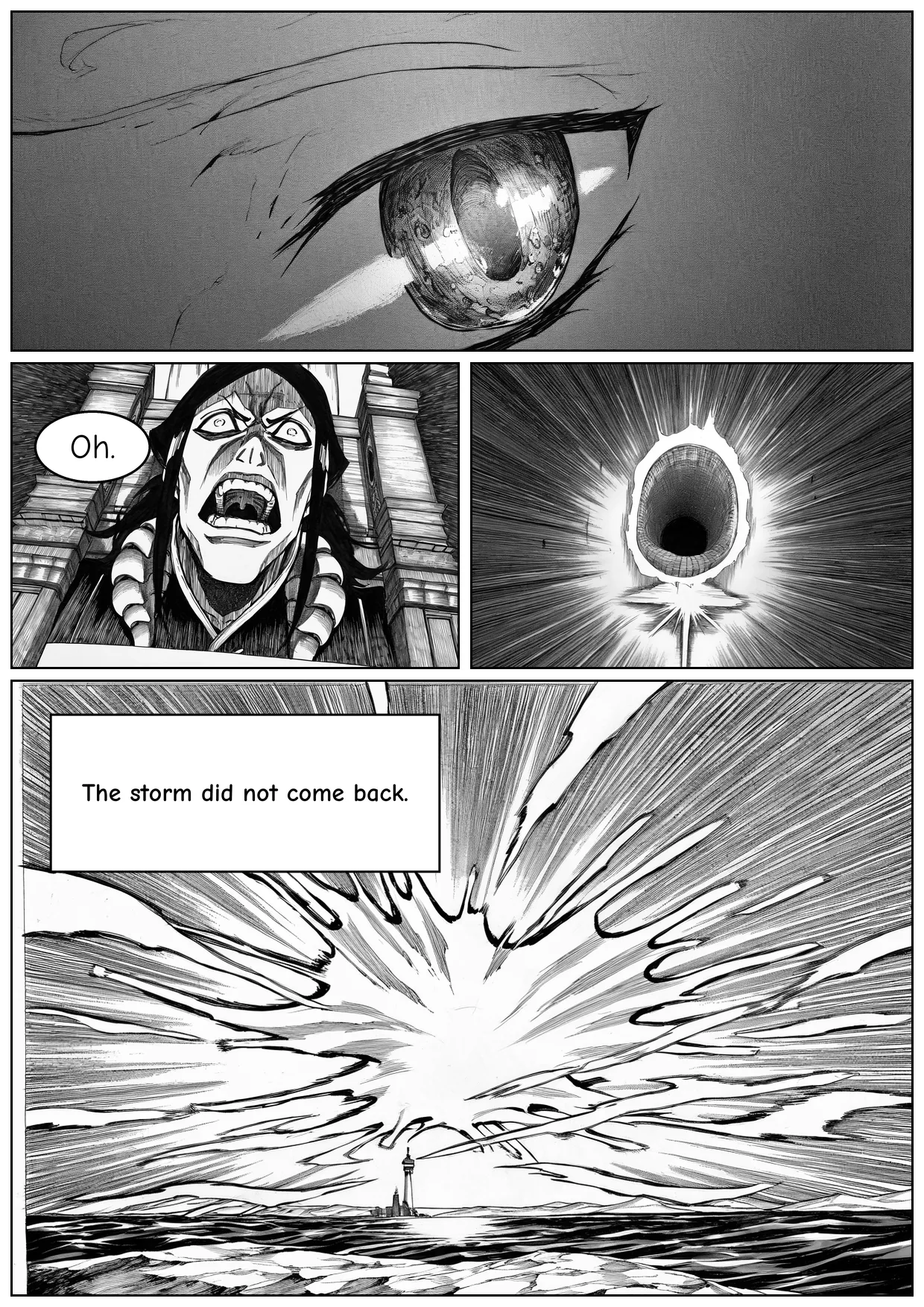
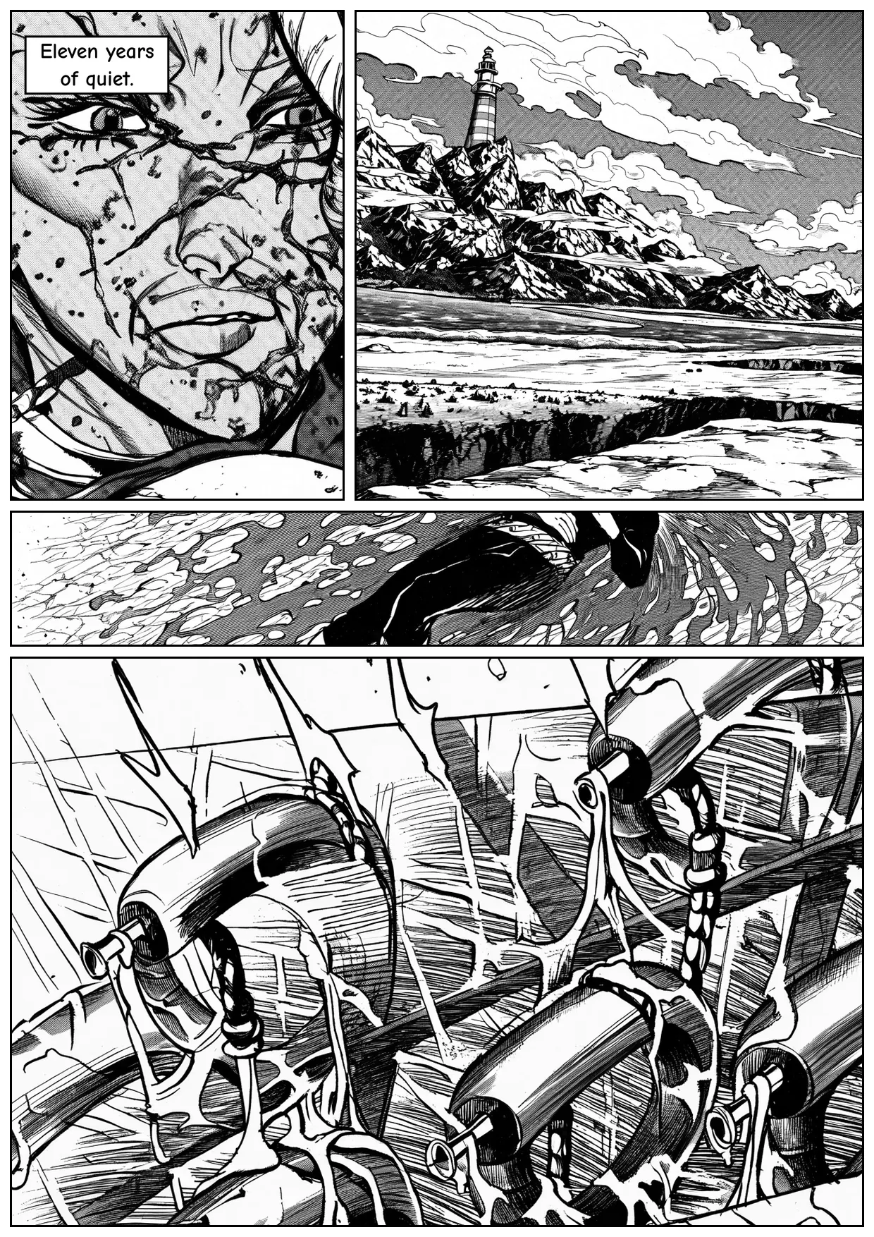
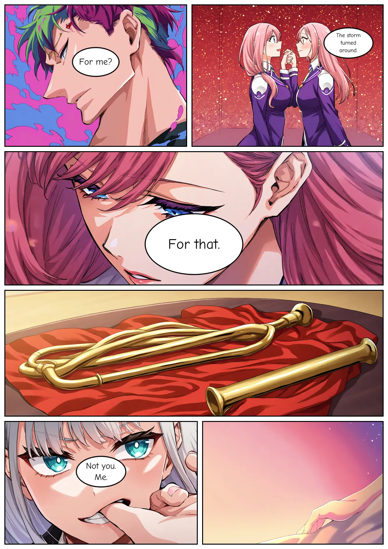
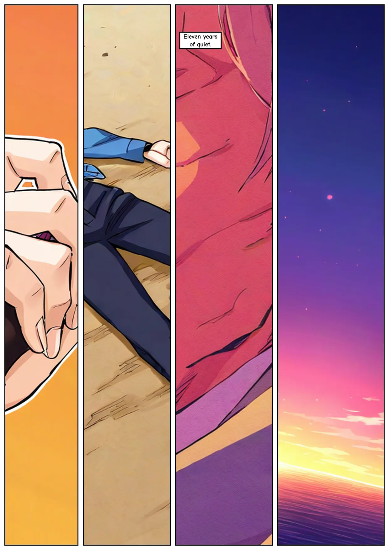
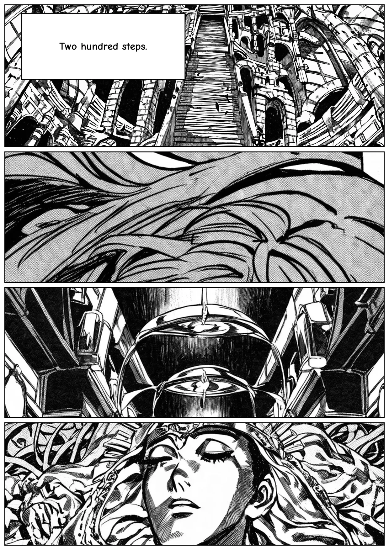
The thing to look at across these pages is the structure rather than the art. Four-to-six-panel pages with varied slot shapes, dialogue inside panels and off faces, consistent font size within each page, and one page in each set deliberately using Kanojo Okarishimasu's conversation grid under ink that has nothing to do with Kanojo. Style and paneling are separate controls now, and that page reads as a conversation page because of its layout rather than its drawing.
Every page writes a text manifest alongside it:
template: kano-6a
page: 1240x1754  rtl=True  gutter=14  border=3
median crop: 0.00%  worst: 0.00%  (target <3% median, alarm >8%)
panel 0: slot=[612,14,1226,469] src_size=614x455 crop=0.00%
panel 1: slot=[14,14,598,469] src_size=584x455 crop=0.00%
panel 5: slot=[14,1345,632,1740] src_size=618x395 crop=0.00%
Panel 0 lands at x 612 and panel 1 at x 14, because right to left is the reading order. The manifest names the template, so any page traces back to the mined layout that shaped it. That crop=0.00% is the number I was most pleased with at the time, and it is the one I trust least now.
What Is Wrong With These Pages
Uncommon nouns do not render. The brass tube came out as a generic mechanical weapon shape, because Danbooru has no tag for it and because I hand-wrote the demo prompts, bypassing my own prose-to-tags allow-list. That is precisely the failure the allow-list exists to prevent. There is also no character consistency across panels, which is expected without a character LoRA, and age adjectives are largely ignored, so "old woman, weathered face" renders young.
Then the real one, which I got wrong at the time. The render-to-slot crop metric reported medians of 8% for the monochrome set, 50% for colour, and 59% for JoJo, while every composed page reported 0.00%. I wrote the first number off as a broken metric, probably confounded by bubble detection, and moved on.
The metric was right and I was wrong. My demo script pins a template on page 4 only. The other four pages carry template: null, so the planner samples one, frequency-weighted, from an unseeded generator. Each style run planned its prompts against one template assignment and then composed its pages against a freshly sampled one. Page 4 is the only page that agrees across all three runs, and the only page whose crops are small in all three.
The manifests show it plainly. Colour page 1 landed on a template of four full-height columns at aspect 0.20, while the prompts file had planned its first panel at 1280x896, a landscape bucket at aspect 1.43. That panel discards most of its render. This is exactly the planner-versus-generator disagreement my crop alarm was built to catch. It caught it, told me, and I explained it away.
So the honest headline is narrower than the one I first wrote, and it is still the result I wanted. Every render came out at the size the planner asked for, nine different sizes across one story. Over the whole mined library, fitting slots to the bucket ladder forecasts a 1.55% median crop against 48.2% for part one's single fixed bucket. The monochrome set, where plan and composition happened to agree, measures 8% median rather than zero. And the composed 0.00% is measured after the panel has already been fitted, so it was never evidence of anything. The fix is one seed passed into the planner, which is embarrassing in proportion to how long I spent defending the number instead.
What the Measurements Actually Tell Us
| Stage | Planned | Actual | Note |
|---|---|---|---|
| Extraction and layout dump, 11 series | 70 min | 29 min | I/O-bound on the network volume, GPU at 25-55% |
| Dataset prep, captioning, trigger gate | 25 min | 6 min | Includes the token-1 verification |
| Sanity train, 40 steps | 10 min | 14.5 min | 13 of those minutes were one-time latent caching |
| Full train, 4,200 steps | 170 min | 72 min | Latents already cached |
| Eval grid, 124 renders | 45 min | 13 min | Including a second bleed run |
| Demo pages, 66 panels across 3 styles | 45 min | 20 min | 15 pages |
| Total spend | $8.49 | $2.82 | 3.71 h of uptime at $0.76/hr |
The one cost predictor that held up was pixels, not pages. The 1520x2400 colour series took three times the wall clock per page of the 800 pixel scans and yielded twice the panels. Page counts told me almost nothing about how long a run would take.
The qualitative evaluation deserves the same reading as part one's. Checkpoint selection was visual judgement over fixed-prompt grids, the bleed test is three images at a time, and there is no formal human-preference study or style metric anywhere in this project. For a personal engineering project aimed at a visual style that is a reasonable method, and for a reusable benchmark it would not be. The 214 tests are worth the same scepticism. They ran on code that could not touch a GPU until training finished, and the deferred GPU checks then caught two bugs no amount of CPU testing would have found: the compel crash and the page-furniture negative.
I wrote ten acceptance criteria before starting, which turned out to be the plan's best feature, because it made "done" checkable instead of a matter of mood. Seven are cleanly met: three distinct triggers, 71 layouts against a target of 25, the forecast crop target, mono and colour from one script, right-to-left reading order, a green test suite, and the budget.
Two are half-met, and I only found out while writing this. Speaker-anchored bubble tails work and are tested, but every panel in the demo script has an empty characters list. There was nothing for a tail to point at, so no page in the shipped demo actually exercises them. And the crop criterion holds as a forecast over the library while the demo run measured worse, for the reason above.
What Is Missing, and What I Would Redo
Reference-image handling has three modes and only one works. Style transfer, image-to-image at strength 0.4 to 0.75, works. Composition transfer through ControlNet, which would keep a pose and framing while redrawing everything else, is implemented with the model downloaded and never ran on a real render. Identity transfer is best-effort by design, because no zero-shot identity adapter exists for this model class and the FaceID dependency is a known install hazard I would not add to a live environment mid-run. The real answer for identity is a character LoRA stacked with the style one, about $1 and 45 minutes per character, built with the same multi-concept mechanism as this phase. Multi-row L-shaped layouts still need the tree-style schema from earlier.
Four things I would do differently, written down while the memory is fresh:
- Pass a seed into the planner. One unseeded sampler is the whole reason the demo pages and the demo prompts describe different layouts.
- Write the reading-order assertion on day one. It was the last test written for the thing it protects, which is why the convention mismatch survived two passes. If a convention is stated in a docstring, enforce it in code immediately.
- Actually use my own prose path. I hand-wrote the demo prompts to save quota, routed around the allow-list, and got a brass tube rendered as a weapon.
- Never block on my own approval. The pod sat idle for roughly 45 minutes, about $0.55, waiting on a message that was already typed and not sent. That was the one real waste of the phase, and it was advice about saving money that cost more than the idling it prevented.
IP Boundaries, Same as Before
Everything I wrote in part one still applies. These adapters were trained on artwork from third-party manga properties, for my own learning, and the technical process grants no right to redistribute the source pages, the panel datasets, the characters, or anything commercial. The layout library is a more interesting case, because it contains no artwork at all, only normalized rectangles with frequency counts. That is about as close to plain facts about pages as a dataset gets. The tooling itself stays reusable for anyone training on work they own.
The Takeaway
Part one's lesson was decomposition: let each component do the job it is actually good at. Part two's lesson is that the same idea applies to the order information flows between them. The layout of a page is not a rendering decision to be made once the art exists. It is input to the art. Once the template is chosen before generation and every panel is drawn for its own slot, decapitated portraits and letterboxed wide shots stop being defects to fix and simply do not happen.
The second thing I would pass on is that multi-concept training is badly underused for small projects. Three styles in one file cost me $0.45 more than one style would have. What made it safe was captioning hygiene, plus an evaluation built to catch the one failure I was afraid of. Triggers at token 1, balanced exposure, divergent palette anchors, and a bleed test I could watch while the run was going. The same mechanism is what will make character LoRAs affordable.
The habits that kept paying are dull ones. Verify the state you care about rather than a string that correlates with it. Look at the pixels instead of a scalar threshold. Write your definitions down before two careful people measure the same thing and get different answers. And when an alarm you built yourself goes off, believe it before you explain it away. Mine was right and I was not. The pipeline otherwise kept its shape from part one. The image model still only draws art, and everything a reader reads is still deterministic code. What changed is that the art is now drawn for its place on the page instead of being salvaged into one.
Postscript: Why Character Consistency Still Failed
The first thing I did after shipping this phase was the thing this post ends by promising: train a character LoRA and stack it on the style adapter. It trained, it loaded, and it cost roughly what I forecast. Then I ran a 32-panel fight scene through it, two characters on one rooftop over one night, and the result is the set of images below. Fifteen of the 32 panels carry the character adapter at 0.7 under the style adapter at 0.35. The other seventeen are style-only, because the second character never got a LoRA at all: he is specified in every panel by the same eleven-tag bundle pasted verbatim into the prompt, and eleven tags are not an identity, they are a search query. Every panel is an independent sample from everything in the model that satisfies old man, muscular, long white beard, prayer beads, open haori, and that set is enormous.
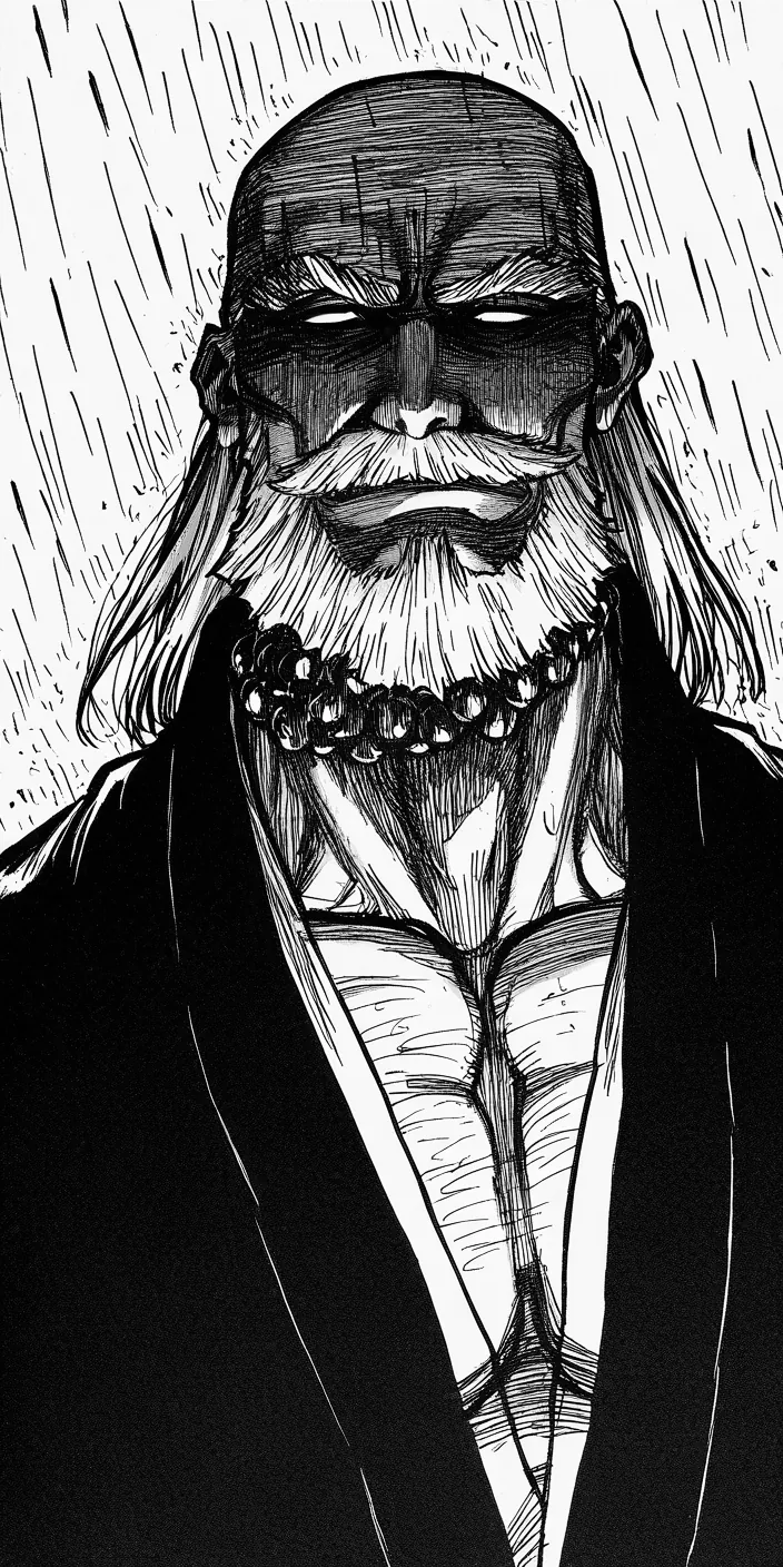
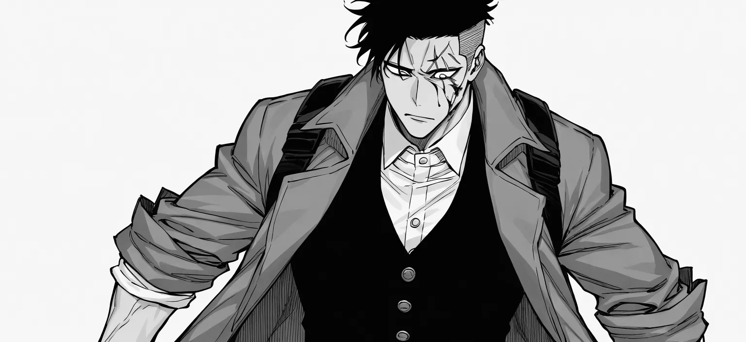
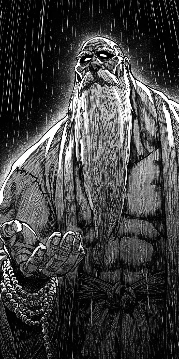
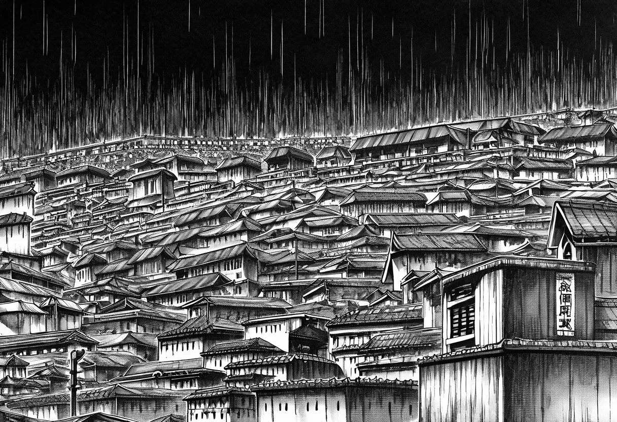
Figure 14. Four panels from the 32-panel fight run. Top left and bottom left are the same character, described by the same tag bundle, in the same run.
Look at the left column. Same bundle, same scene, four panels apart in the same run: one is a heavy-featured man with a thick moustache and long hair falling either side of his face, drawn as black ink on white; the other is a gaunt ascetic whose beard reaches his waist, drawn as white ink on black. Not the same man, and not even the same tonal key. That much I expected. The panel that does have a LoRA, top right, is the more useful failure. I built its training set from a single design render, full body, standing, arms at sides, on a white plate, fanned out to 28 camera angles with Qwen-Image-Edit. Azimuth control worked. Distance and elevation did not, because that adapter was trained on photoreal renders and flat-fill line art gives it far less to hold on to, so six of the eight frames I asked for as close-ups came back as the same standing figure. I wrote them into the dataset captioned close-up anyway. Mislabelled data is worse than missing data. All 280 samples then landed in one training bucket at 832x1216, which puts a face inside a full-body plate at roughly ninety pixels, so there was nothing there to learn a face from either. My captions were deliberately minimal, trigger plus camera tags and nothing else, on the theory that whatever goes unnamed binds to the trigger. It does. What went unnamed here was the white plate and the arms at the sides, so the adapter learned a coat, a stance and a background, and it learned that close-up means a standing figure. Ask it for an extreme close-up of one bloodied eye and it draws a man standing in a coat. Bottom right is the closing establishing shot, and it is the one that convinced me the problem is bigger than faces: the prompt reads tokyo skyline, dawn beginning, rain easing, and what came back is a beautiful Edo-period tiled roofscape at midnight in the same downpour as page one, with invented kanji on the signboard. The setting has no LoRA and no trigger either, so a rooftop the reader is meant to recognise from panel one is, to the model, thirty-two unrelated rooftops. Nothing in the prompt could have overridden any of this, because these prompts run 141 tokens against a 77-token window and my own shot code puts framing last, on the stated theory that framing is the least important thing and should be the first to fall off the end. That was right in part two and exactly wrong here. So the honest diagnosis is not that a character LoRA was the wrong idea. It is that I trained one on 28 rotations of a single drawing and then asked it for poses and framings that drawing never contained. The next attempt is not more steps. It is a training set shot for the job: real framing variety with the crops to prove it, a bucket ladder that actually contains faces, captions that name the background so it stops being part of the character, an automatic check that the fan-out returned the view it was asked for, and a LoRA for every named member of the cast rather than half of them. Part two's lesson was that layout is input to the art rather than a decision made afterwards. Identity is input too, and I had spent a dollar teaching a model to draw a coat.
Methodology and Limitations
Based on: one multi-concept LoRA training run, three concepts and 4,200 steps on NoobAI-XL v-pred 1.0, on a single rented RTX 4090; 5,109 pages extracted across 11 series; a mined library of 71 layout templates; the project's committed run logs; and 214 passing tests over the lettering, composition, layout, and generation code; the postscript adds one character LoRA trained on a 28-view fan-out of a single design render, and the 32-panel fight run generated from it. Every figure in this post is a generated output, a composed demo page, an eval artifact, or a wireframe sheet from that pipeline.
The stack: Magi v1 for panel and text detection, WD14 SwinV2 v3 for caption tags, Kohya's sd-scripts at a pinned commit for training, NoobAI-XL v-pred 1.0 as the base, diffusers 0.32.1 with compel for generation, Pillow and OpenCV for lettering, numpy for post-processing, and plain Python for the mining, planning, and composition.
Limitations: checkpoint selection and style evaluation were qualitative, and no formal benchmark or human-preference study was run. Character consistency across panels is unsolved, and the postscript above is one failed attempt read off its own output rather than a controlled comparison; no intermediate checkpoints of that character LoRA survive, so the overfitting claim in it is inferred from the renders alone. Reference-image composition mode is implemented but never verified, identity mode is deliberately best-effort, and speaker-anchored tails are tested but unexercised in the shipped demo. The demo pages carry a real render-to-slot crop, described above, because four of five page templates were sampled unseeded. The adapters were trained on third-party manga artwork and are documented as local research results, not redistributable products.
Weights and Code
The trained adapters are on Hugging Face: the Bleach and JoJo multi-style LoRA and the Rei character LoRA from the postscript. Both are part of the Manga Finetuning LoRA Collection, which gathers every adapter from this project. The full source code is on GitHub.